Don’t
you just love the word “verve?” Something about it makes me smile. While reviewing
the Pantone Fall 2014: Fashion Report,
I came across a line that describes Aurora Red – “a more sophisticated red that
adds verve and spark” in comparison to the Pantone color Sangria which is
described as “an exotic red that evokes a sense of glamorous adventure and
faraway destinations.” I swear, when I read these color descriptions I always
feel like I should be in the caverns of a winery doing a bit of wine tasting.
No
matter the verbiage, I love the color red and it tickles me that Mother Nature
seems to like it too and favors us with a variety of stones within a wide variance
in the red color range. My love of the color red goes way back – if you’ve read
any of my Throwback Thursday posts, you’ll see that the color red played a
significant role in my wardrobe over the years. Today, I have very few pieces
of solid red clothing – shoes are the exception to that rule; but lucky for me,
I do own a lot of red jewelry, vintage and new, and toss it in and out of play
with pieces that come from the studio.
I
know this might sound strange – but, sometimes, I think the color red is a bit
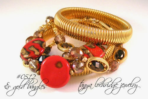
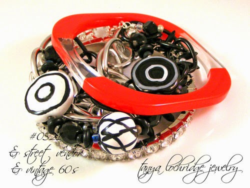
of a neutral. For that reason I style it with lots of different colored beads and gemstones.
Curious, do you agree or disagree? It might depend on the exact shade of the
color red. Now that I look at the images here, it might be that the more
natural shades of red gemstones, like the poppy jasper, are more neutral when compared to
the lampwork bead bracelet design. Something to ponder or put you to sleep.
This red and black Bohemian lampwork piece always takes me back to the moment I
developed my respect for red glass. I was studying leaded glasswork with a
wonderful fourth generation Irish glass artist in Newport Beach many, many,
many moons ago. I had designed a window that was primarily created around
various types of red glass. Well, did you know that red is one of the most
difficult glass colors to work with? Yes…it’s true. While the finished project
was beautiful in the end, my box of broken and poorly cut glass scraps was
huge! At the time, Wesley thought it best not to discourage me when he saw my preliminary
sketches…and I am glad for that as my appreciation for the color red grew from
my overall experience and challenge in working with it. It was a definite love-hate kind of
thing!
Thank goodness we've reached the end of that little side trip; and, how I even get into those little excursions, I have no idea. At times I think James Joyce would be proud of me! Anyhow, I would love to hear your
thoughts on the color red in clothing and accessories. Do you wear it; and ,if so, how? In large
blocks or as a pop of color? I’m hoping that the pix here give you some styling
inspiration and perhaps lead you to a place you’ve never been – not like the
South Pole or some other geographic location – but a styling place that is new to you. It’s
always fun to experiment with new colors and new designs, isn’t it?


No comments:
Post a Comment